Profile redesign
A new profile experience that is less superficial, while keeping the "swiping game" enjoyable.
My role
Sr. Product Designer
Team
16 people
Date
2021
Duration
6 months
Responsabilities
UX, Research, Design System
Context
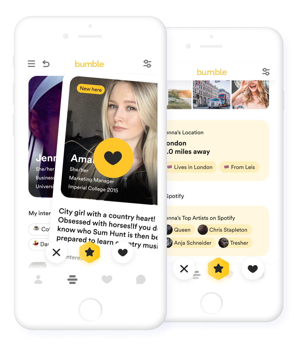
The profile isn’t telling a story about the human behind it, it doesn’t effectively marry up the physical attributes of a person to their personality. Discover new people in Bumble is easy, it takes a swipe left if you don’t like a person or a swipe right if you like her. In a few seconds, the user can check the image and place a vote. This kind of experience is superficial and sometimes doesn’t bring any value. We made a new profile less superficial which help people to express better themselves and know more about others.
Problem & Opportunity
From the research, we know that most of no votes placed by women were made in an average of 1.5 seconds, which means that they don’t check other details than just the picture (aka give someone a chance). At the same time, male users are not able to stand out and get yes votes if they don’t have a nice profile picture. The yes votes are crucial for the business. More likes means more matches, and more users buying premium features. If users get yes votes they are more likely to buy the Premium and boost their profiles.
Hypothesis
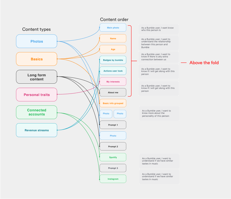
- If we bring the most relevant profile info above the fold we can increase meaningful connections
- if we give users the ability to better express their personality we can help them to meet relevant people
- if we add a new revenue entry point above the fold we will boost revenue growth
The profile isn’t telling a story about the human behind it, it doesn’t effectively marry up the physical attributes of a person to their personality.
Research & Strategy
The research findings were essential in shaping our design decisions to ensure the design was as intuitive and familiar to the users as possible. I also aligned efforts with the product manager to scope out the initial launch, lay out the requirements and discuss post-mvp features to test. Dev-design pairing came in once the flow was close to completion. This way, we were able to do design QAs in real time and communicate on the spot, preventing miscommunication from happening.
My activities
UX audit (Old profile)
User research
Competitor analysis
IA analysis
Ideation workshop
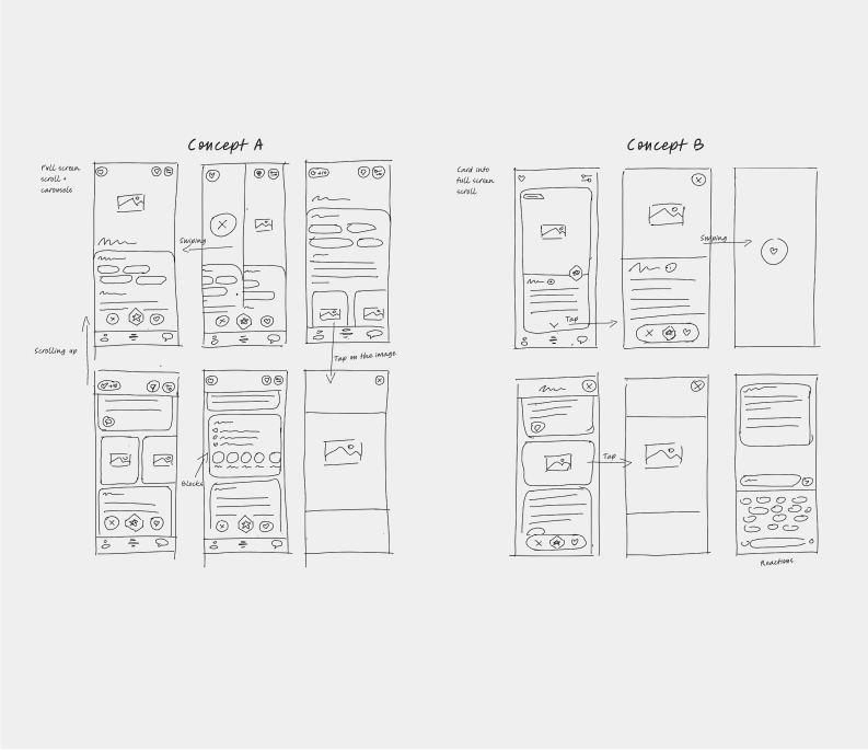
2 Prototypes
Accessibility check
Usability testing (2 variants)
Final design
Solution
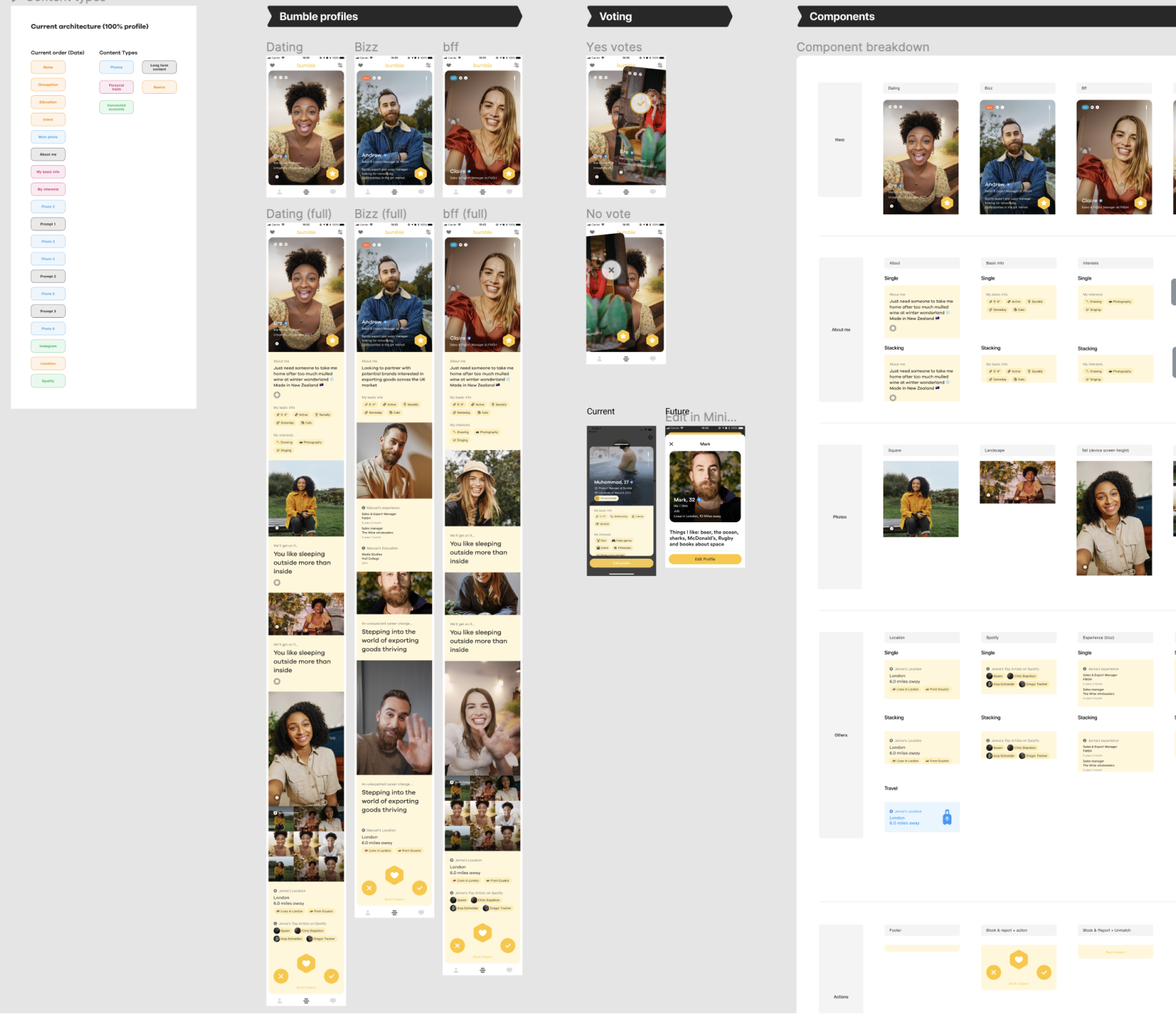
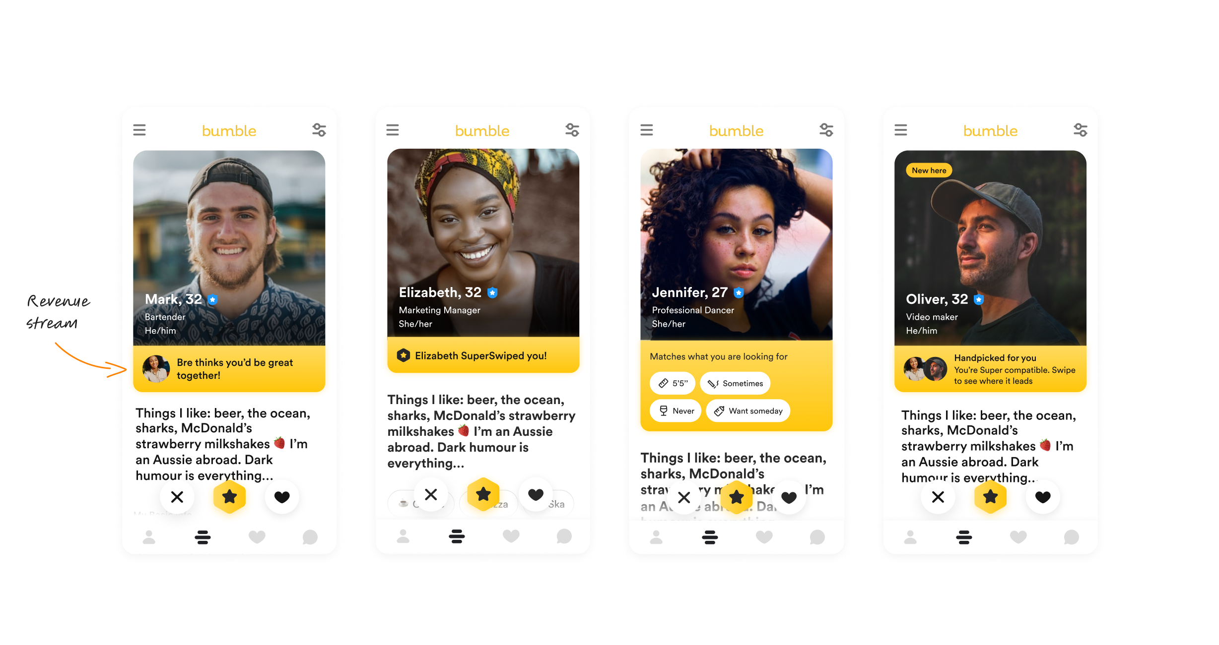
Once we had enough confidence in the key findings, I made a new design combining the most relevant part of the two prototypes we tested. A new profile with a new information architecture which is more valuable for users. The profile picture is not as prominent as before and this helped us to bring more info above the fold such as biography, interests and a new revenue entry point just below the picture.
For this project I've used the components and colours available in our Design System. I worked with Design System Devs to optimize a new component to display above the fold as a new revenue entry point.
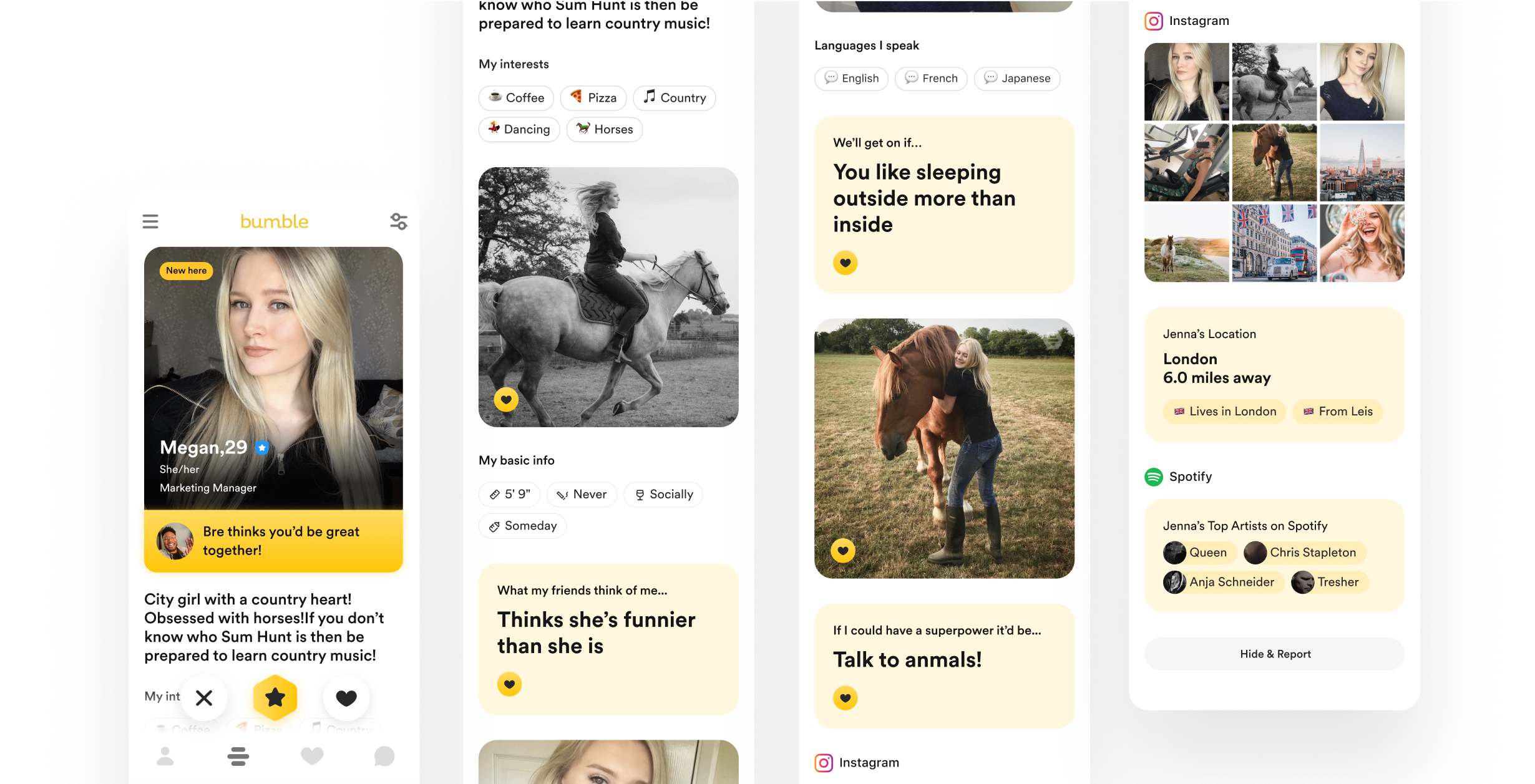
We tested a few solutions and ended up with one that was more closely tied to the main user information such as name, job, pronouns and profile picture. This new pattern highlights the most crucial details for users seeking potential dates, serving as a successful new revenue entry point.
Results
We had an increase of yes votes and time spent on content for both genders. It means that the yes votes were lead by the consumption of content. We improved the Profile experience and increased the revenue (male buying premium, spotlight etc.).
Next Project
Player redesign
A new player to enhance the music experience and give users more control over the lyrics.
© Frank Rapacciuolo 2022 Product designer