Core Funnel Redesign
Redesigning the Discover page to improve event visibility, boost participation, and drive conversions.

My role
Head of Design
Team
4 people
Date
2025
Duration
3 weeks
Responsabilities
Design Strategy, UX Research, Growth
Context
Clyx is a social app helping people find events and make new friends in real life. The Discover page is the main screen users land on after onboarding — and it plays a critical role in retention, engagement, and revenue. However, we noticed high bounce rates, a lack of interaction, and confusing navigation. The page was failing to convert casual browsers into active participants. I led the redesign of this core experience, aligning product UX with business goals: increasing joins, improving community visibility, and boosting ticket purchases.
Problem
Discover was underperforming as a funnel. Despite being the most visited page after onboarding, only 9.7% of users tapped "Join" on an event. Engagement with communities was even lower. Many users scrolled but didn’t take action — and creators struggled to get visibility for their events.
We identified 3 key problems:
- Ambiguous interactions – users weren’t sure if they'd be charged when tapping “Join”
- No structure or hierarchy – events, ideas, and groups were mixed in the feed
- Low community visibility – the "Groups" button had just a 5.05% CTR and was easily missed
This drop-off created a downstream impact:
- Lower event attendance
- Fewer paid ticket conversions
- Less value for creators and community leaders

The Discover page wasn’t converting scrolls into action, it lacked clarity, structure, and failed to give users the confidence to join an event.
Research & Strategy
We combined user interviews with behavioral data from Amplitude. Users often misunderstood event types or were hesitant to act. Many didn’t know how pricing worked or that some events were free. Interviews also revealed that the feed felt repetitive and that users couldn’t easily filter or browse based on interest. This feedback helped us prioritize clarity, structure, and confidence in the interaction model.
Validation
We ran A/B tests to validate design decisions:
- Dynamic CTAs like “Join for Free” and “Buy Ticket” led to a +41% increase in join taps
- Sticky navigation tabs increased session time by 18%
- New idea card visuals improved scroll depth by 9%
All tests were conducted with 95% statistical confidence, using Amplitude segmentation.


Solution
We redesigned the Discover screen to feel more structured, clear, and actionable. Sticky category tabs allowed users to explore without losing context. Event cards were updated to show event type, price, and availability at a glance. The Join button became context-aware, dynamically changing to reflect the correct action depending on the event. We also introduced placeholder art for draft events (idea cards), helping maintain a visually cohesive feed even when content was early-stage.
Metric
Join CTR (Discover)
Avg. Session Time
Paid Conversion Rate
Before
9.7%
1m24s
4.6%
After
13.7%
1m34s
6.2%
Change
+41%
12%
34%
Over several iterations, the Discover page evolved from an icon-heavy, visually crowded layout to a streamlined and structured experience. Early versions tested different navigation styles and card formats, but lacked clarity and didn’t guide users to take action. Each design cycle brought us closer to a layout that prioritized content hierarchy, simplified navigation, and clearly framed the value of joining an event. The final version focused on doing less — but with more intent.

Takeaways
This redesign turned Discover from a passive browsing surface into an active participation funnel. By aligning UX decisions with behavioral insights and business goals, we increased engagement, built user trust, and created a path to sustainable growth for the product. This was one of the fastest, most collaborative projects I’ve led. We went from concept to live A/B tests in just three weeks, working closely with developers and product in a tight feedback loop. It reinforced how powerful design can be when speed, clarity, and alignment come together.
Next Project
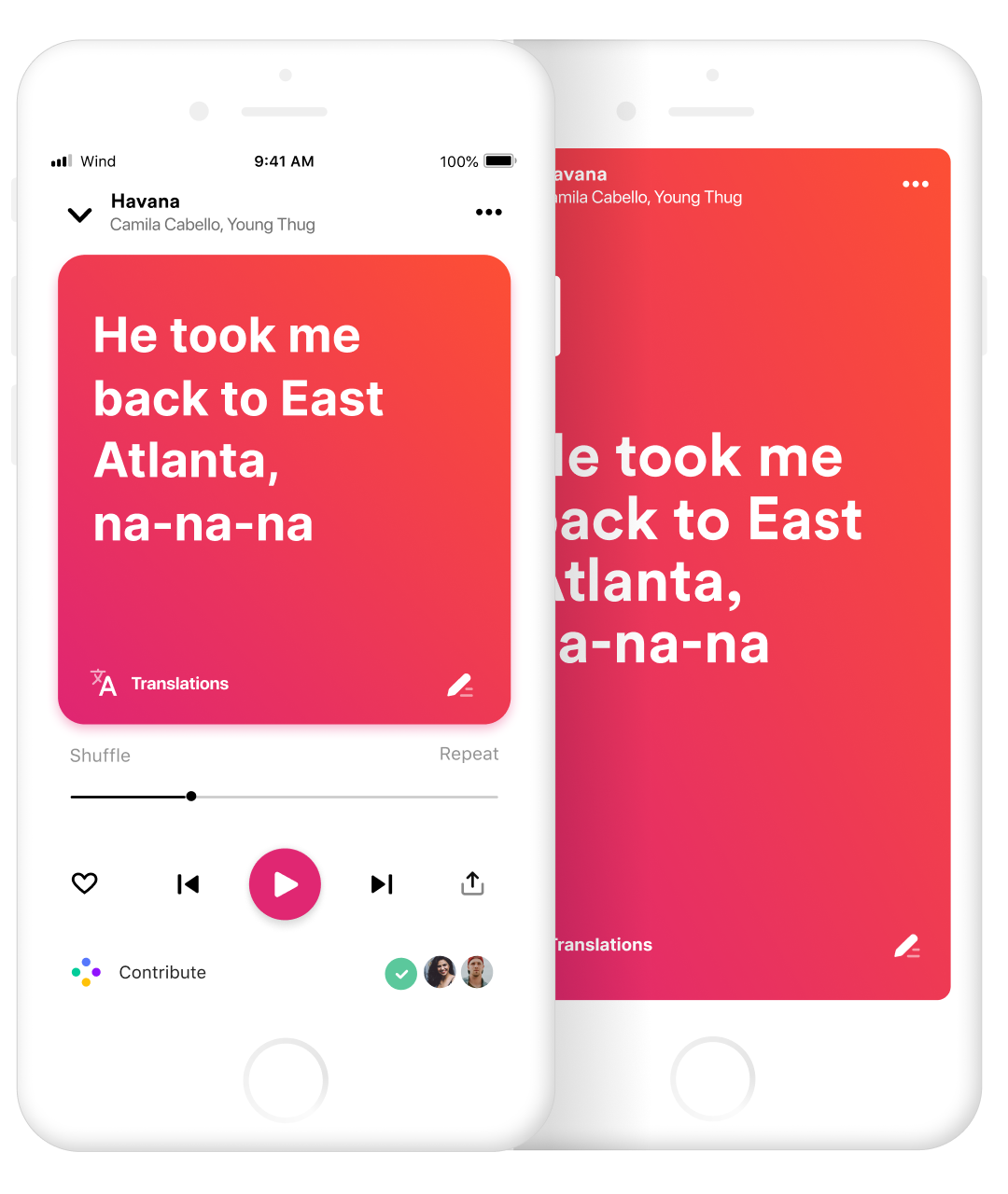
Player redesign
A new player to enhance the music experience and give users more control over the lyrics.
© Frank Rapacciuolo 2022 Product designer